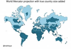
New drawings reveal an error in the world’s most popular map, known as the Mercator projection.
The new graphics highlight the huge differences in countries’ sizes, with the popular “world map” showing North America and Russia as being larger than Africa, while the latter is actually three times larger than North America, and much larger than Russia as well.
These strange anomalies were discovered by a climate data scientist at the Met Office who provided a two-dimensional representation of what the world really looked like.

The new map of the world shows that many countries, including Canada and Greenland, are not as large as some thought.
The distortion of the common map of the world is due to the “Mercator projection”, the most common method of cylindrical projection used in making maps in the world, adopted in schools and in books, and which was established in 1596 to help sailors explore the world.
The biggest challenge in creating an accurate map is that it is difficult to depict the reality of the world in its cosmic form on a flat map, a problem that has plagued map makers for several centuries.
As a result, the shapes of world maps were varied, but this diversity gradually faded with a single model invented by Gerardus Mercator in 1596.
Mercator’s width gives the correct shapes of landmasses, but at the cost of distorting their sizes in favor of the rich lands to the north.
Neil Kaye, a climate data scientist at the Met Office, put together an accurate global map showing that countries near the northern hemisphere are much smaller than people usually think.
He did this by entering data from Britain’s Met Office, with each country’s volumes, into Ggplot, a visual data package for statistical programming.
Then he created the final map using a photographic projection, and this is the mapping function that designs a sphere on a horizontal plane.
“There has been some manual tweaking in the countries closer to the poles,” Kay said, explaining: “This shows that you can’t fit the shapes on the ball again once you put it on the surface.”
Mercator, the Flemish cartographer, born March 5, 1512 – December 2, 1594, was famous for making world maps based on illustrating sailing paths as straight lines. Unlike other geographers of his generation, he did not travel much, and his knowledge of geography was formed from his library, which includes more than a thousand books and maps.
In 1580, he began publishing his atlas, and in Mercator’s model, North America appeared as large, if not slightly larger than Africa, and Greenland also appeared to be of similar size, when in fact, Africa was larger than this and that.
One of the most prominent mistakes of the common map is also that Africa was about 14 times larger than Greenland, knowing that they are about the same size.
Also, Brazil is five times larger than Alaska in reality, while the latter is larger than Brazil on the map.
The map indicates that Scandinavia is larger than India, when in fact India is three times the size of the Scandinavian countries combined.
In fact, our maps seem to put North at the top which is just a convention and has been accepted as true in most parts of the world.


